🔌 Shameless (somewhat shameful) Plug! 🔌
This fun little developer tool got approved and is on the Chrome Web Store now!
Add it to Chrome here! (or go here: https://chromewebstore.google.com/detail/github-pr-title-formatter/pdjmmincfaficadbaemdifkbaioiihob)
Here’s a preview:
Motivation
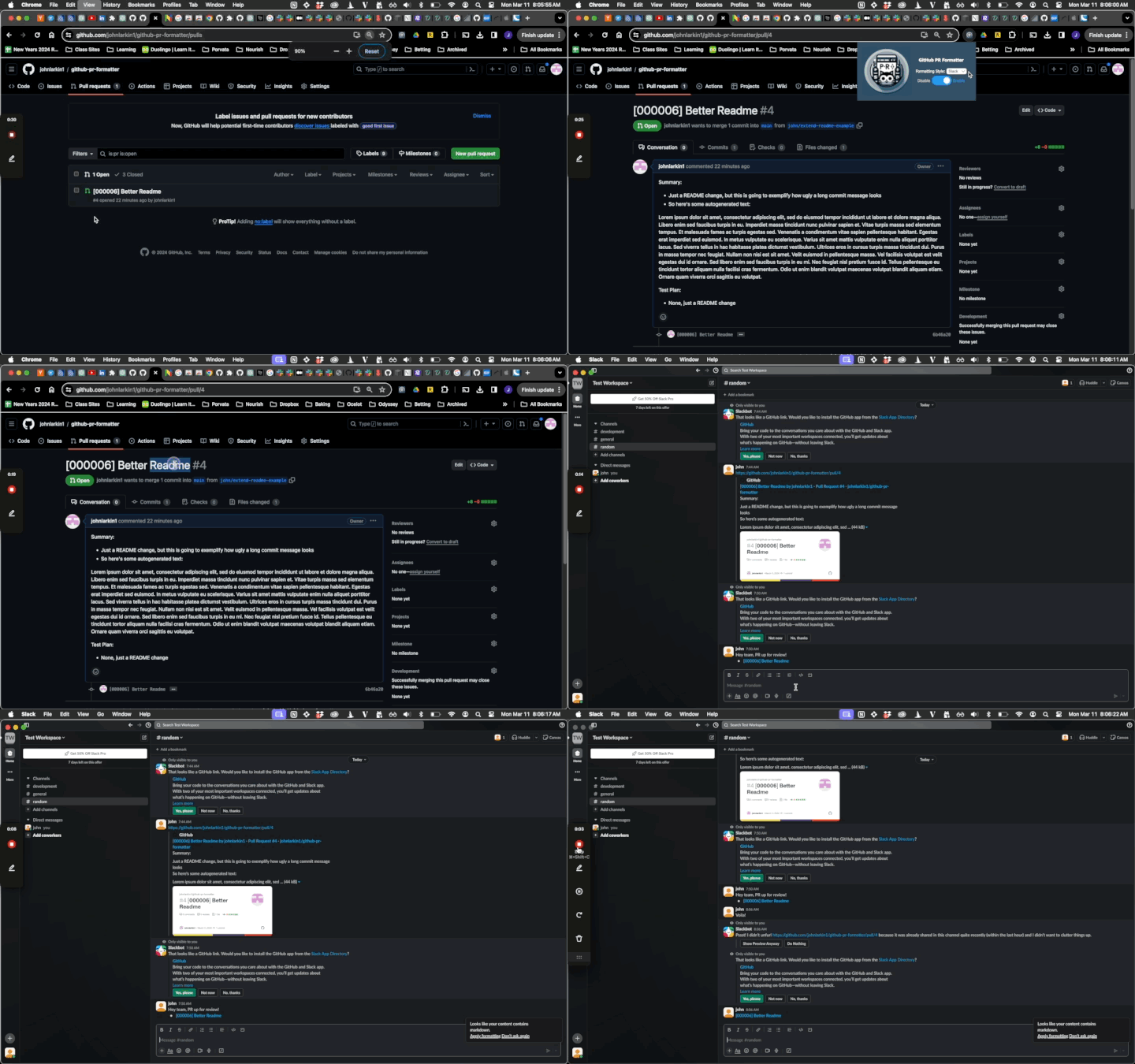
More or less, I’m sick of Slack auto-unfurling my Github PRs into a single link with basically my entire PR description pasted in the output.
Here’s what I mean:

It just feels noisy, and when you’re on a team of developers (and they have two workstreams and multiple people posting in a review channel or referencing PRs), this Github unfurling just takes up too much space.

The thing is, if you’re titling your PRs well, they should convey enough information that other developers on your team will be able to see that in Slack, understand from the title what the PR is roughly aiming to attack, click on it, and then have the details in the normal Github UI like we’re used to.
Solution
So perhaps a fun Chrome Extension can help!
What if we just let you pick how you wanted your resulting link to look in Slack? So here’s how I like it:

Or a little live demo:

Or a bigger demo here:
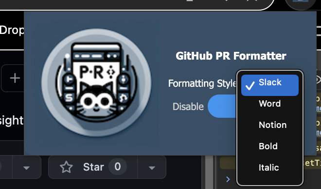
And we have a nice dropdown for different configurations:

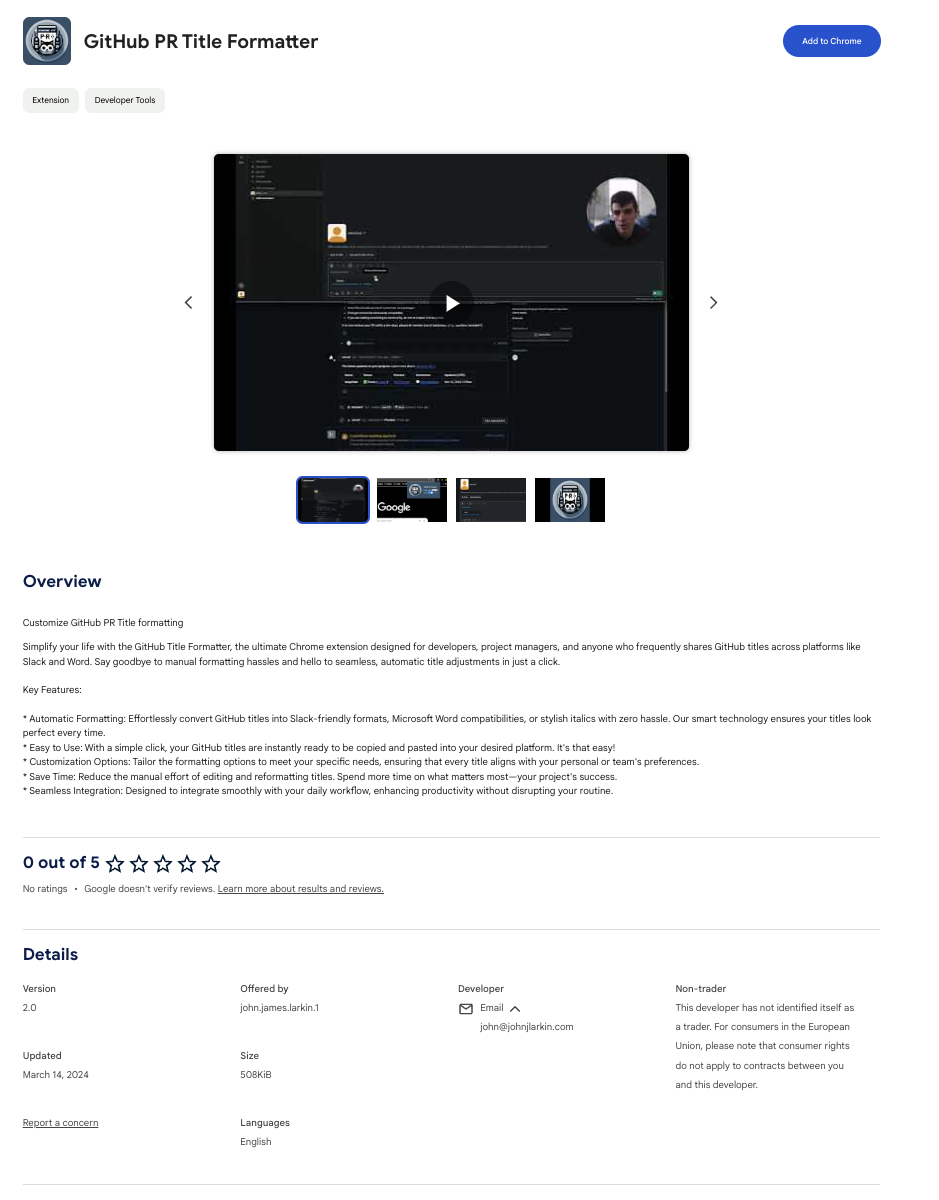
Chrome Store
If you’re thinking, oh this looks great, where can i download it? No problem! Chrome Extension store for the win.
It should be publically available on the Chrome Extension Store, or specifically, you can download it here.
Submission Process
This submission process actually wasn’t too bad at all! More careful specification in the manifest.json for the content_scripts helps to speed up this process. For example, this Chrome extension will only be active here: "matches": ["*://github.com/*/*/pull/*"],. So on Github urls under the pull tab basically.
I ran into some trouble with my Draftkings web scraper but that was more mainly blocked for the extension store not supporting anything related to betting or gambling. You can read more about that here: Chrome Extension, Betting Analysis, and Kelly Criterion.
Code
It’s for sure not the prettiest thing I’ve written, but it is efficient and functional. The CSS and styling isn’t the most mobile friendly, it works on Desktop and I’m fine with shipping it like that (given I don’t think that many people will end up using it, but I like it a lot and so wanted to share).
Feel free to tweak and optimize as you wish (just acknowledge)! Happy hacking!

